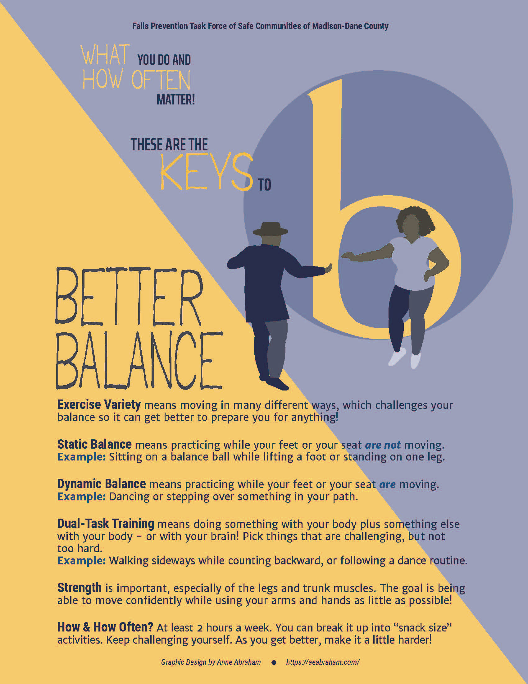
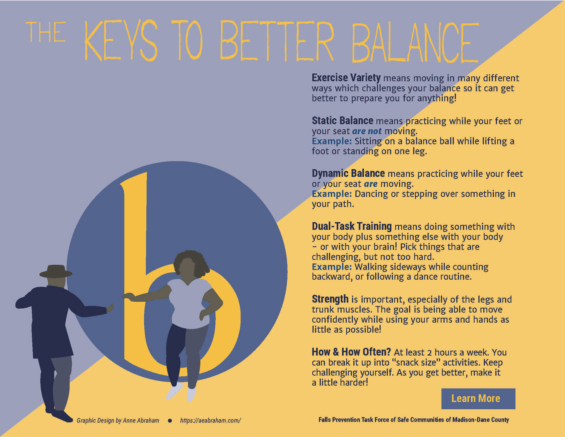
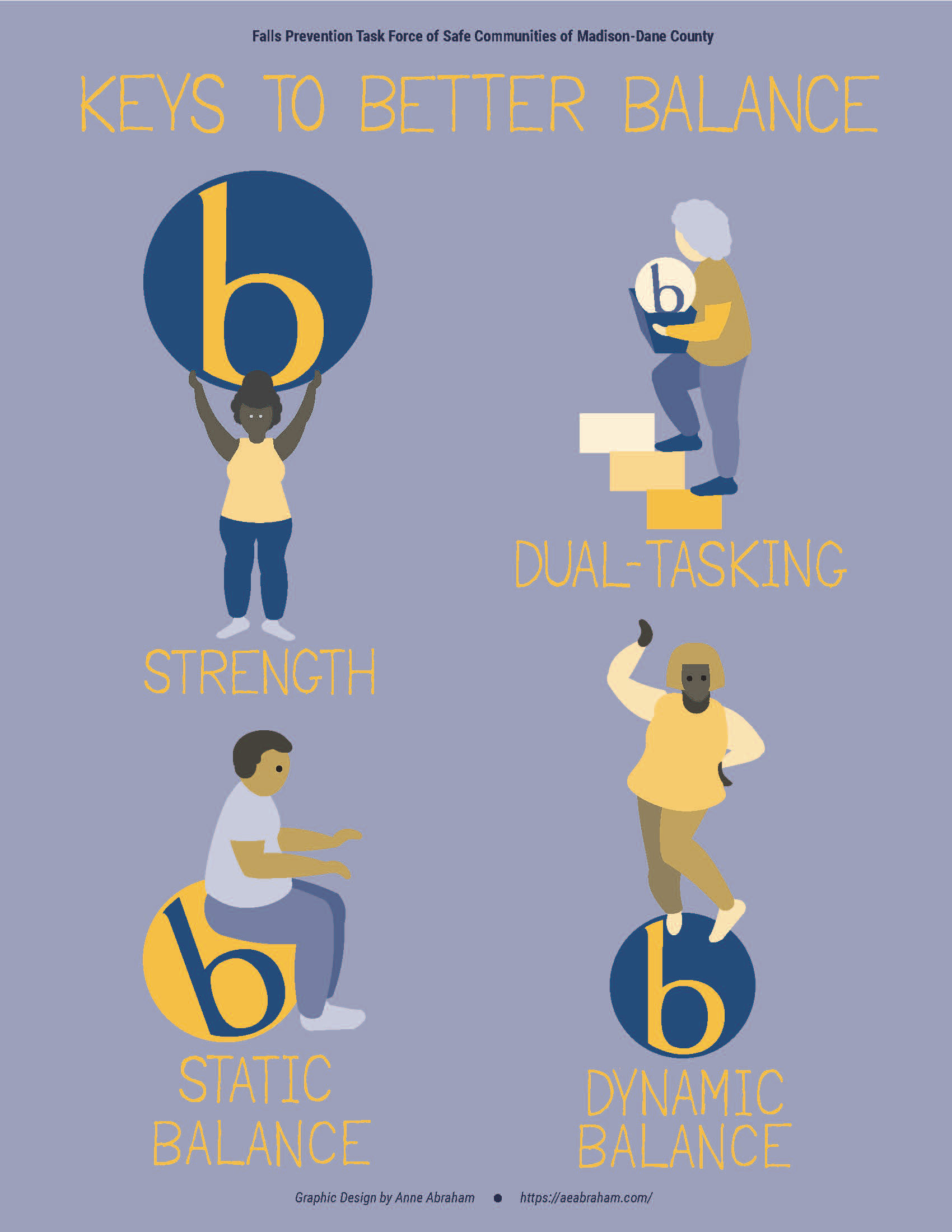
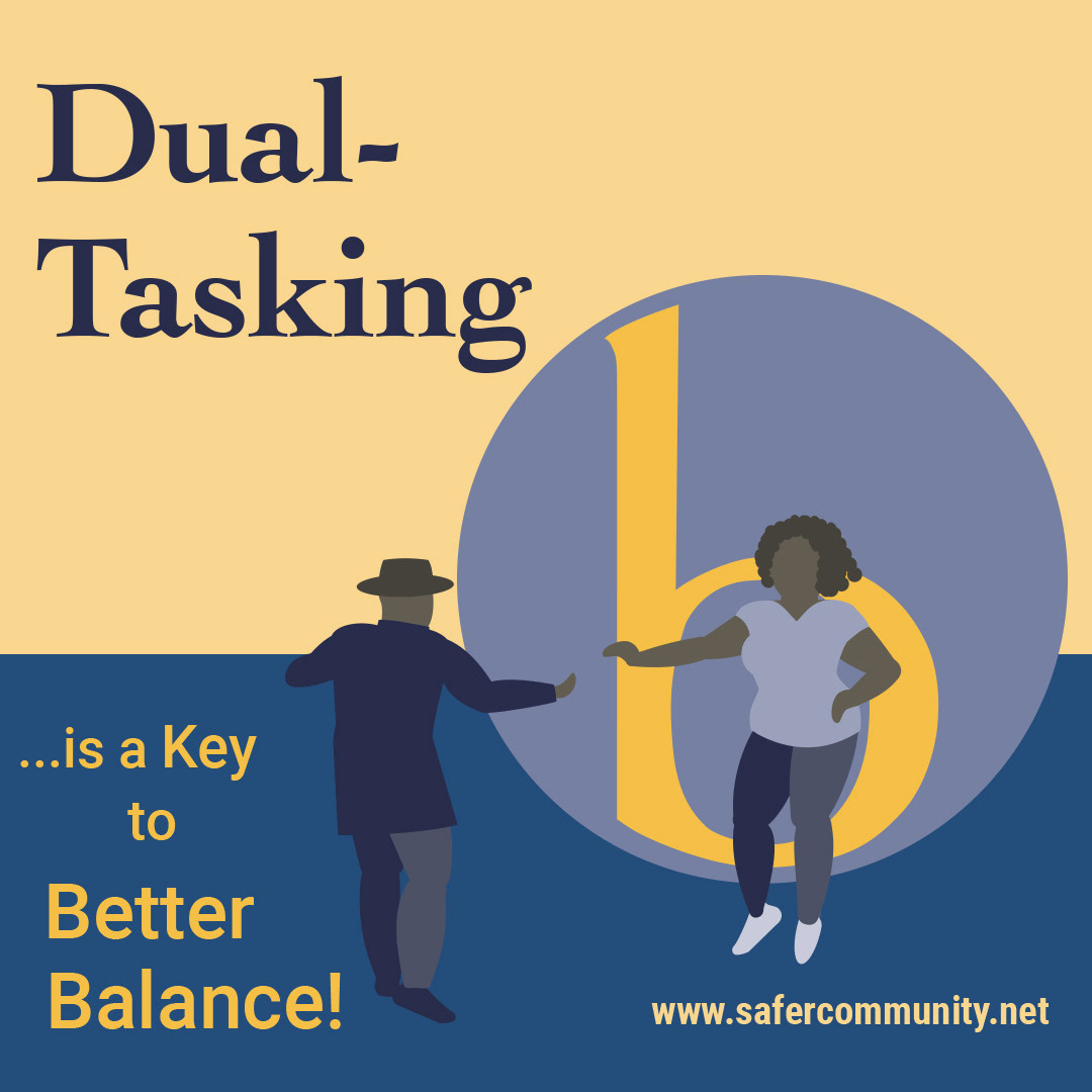
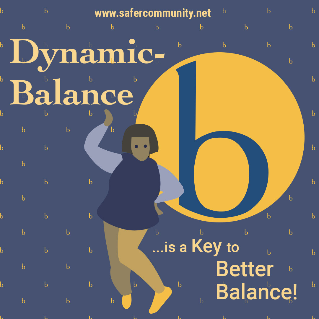
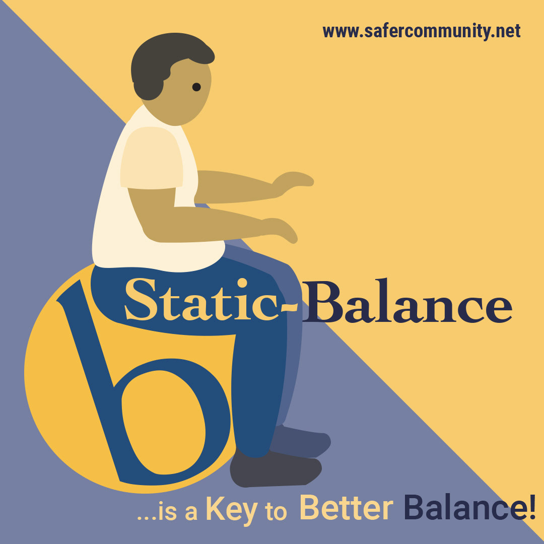
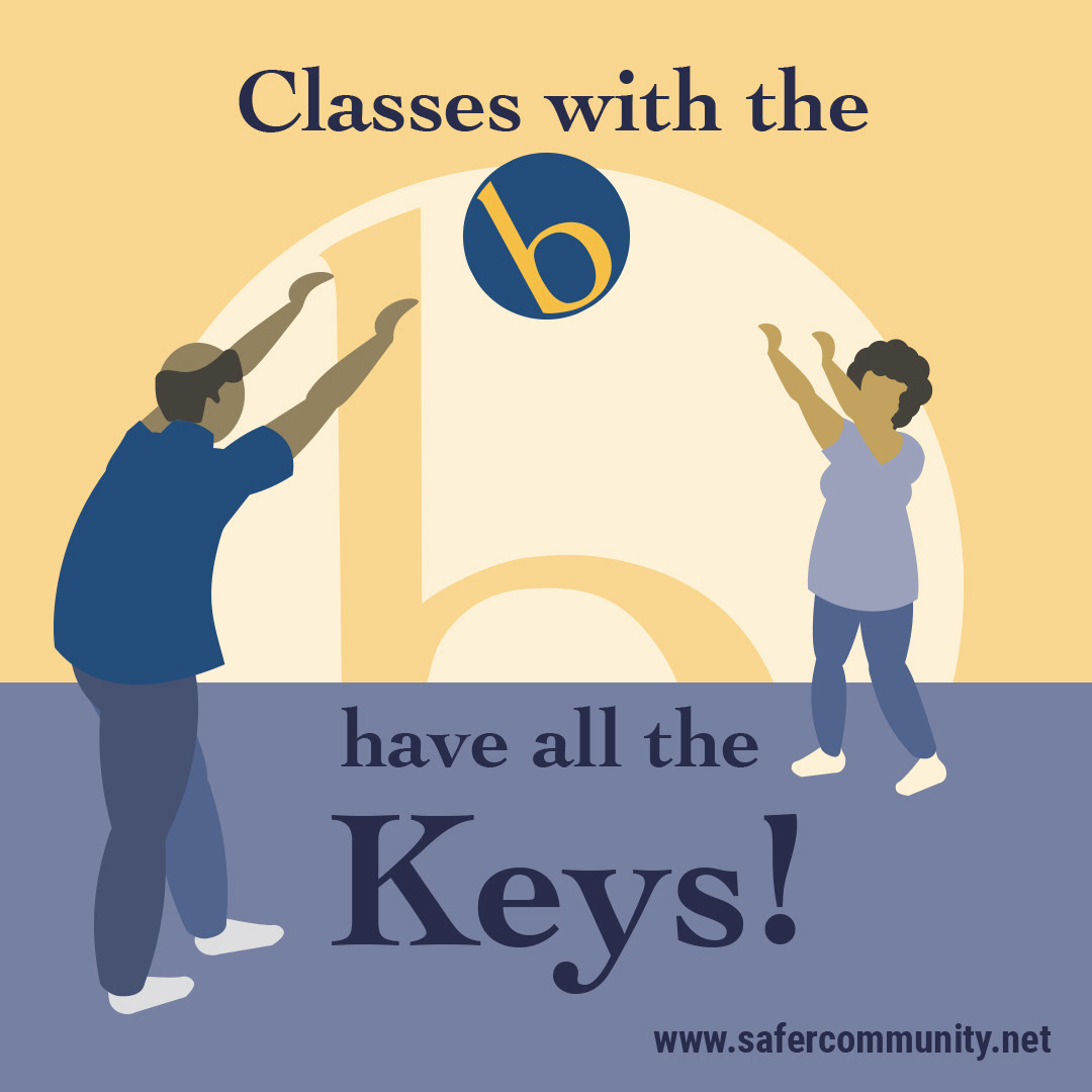
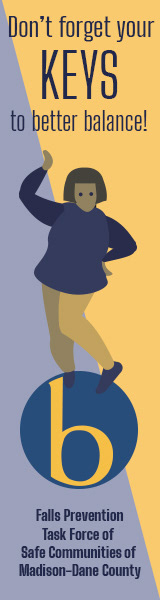
I heard of this opportunity through a fellow Physical Therapist who teaches a Falls Prevention course for Safe Communities organization. Their Better Balance committee wanted graphics to illustrate the elements of good balance. They intended to use these in print and on the web to increase awareness, and encourage seniors to become active in exercise programs that met standards appropriate to improving balance. These visuals would also advertise which community groups – for example, those providing instruction in tai chi or ballroom dance - met the Safe Communities “Balance Stamp of Approval”. The Balance committee already had a logo of a lowercase “b” inside a circle of blue and yellow to serve as the “stamp”.
Meeting with this group - both in person, before social distancing due to the COVID 19 virus, and afterward, online through the Zoom app – I developed graphic images based on their feedback, evolving from generic figures of athletes performing all types of activities to images using simple shapes depicting more common older adults performing specific, targeted activities. The basic “b”-in-a-circle logo was a blessing in disguise, providing a “ball” as well as a lively color palette to show movement in a variety of ways. The simple diagonal background shapes lend a dynamic feeling yet also help “ground” the work in basic physics. Doing this pro bono project in exchange for gaining exposure for my work and providing me with real-life experience working with clients was priceless.